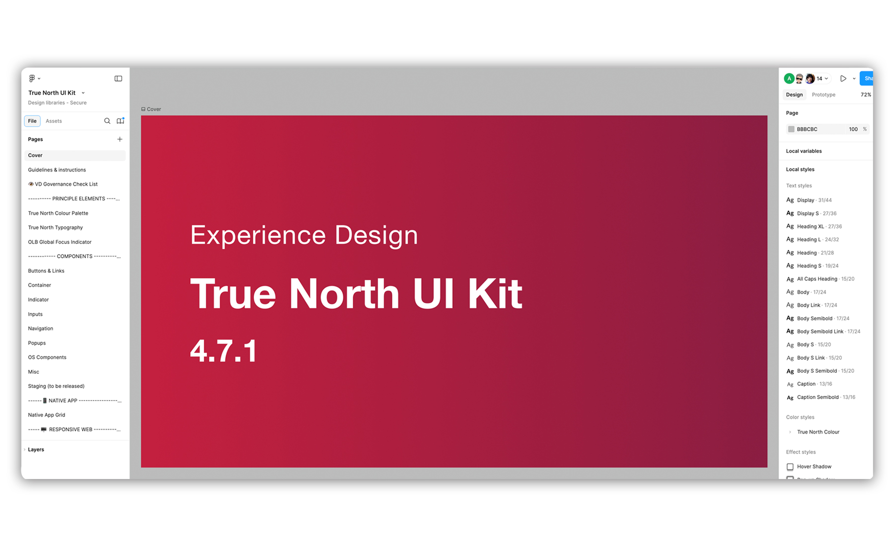
CIBC True North UI Kit
Overview
The CIBC Design System defines the core patterns and components that form the foundation of CIBC’s digital products. It establishes a unified design language and ensures a consistent look and feel across all apps and experiences within the CIBC ecosystem.
Mission
In early 2022, the CIBC Digital Banking team launched a new design team called Platform Modernization, focused on reimagining the CIBC Online Banking website and Mobile Banking app with a refreshed look and feel. As new UI components and interaction patterns were developed, the need arose for a centralized UI Kit to house these elements. This UI Kit will serve as a practical, shared library for product designers—ensuring brand consistency and design alignment across teams within CIBC’s secure banking environment.
What I Have Accomplished
I built the UI Kit from the ground up in Figma, developing a functional system that includes colour, typography, and numerical variables. I worked closely with brand team designers to ensure every UI component was accurately constructed, and collaborated with developers, key designers, and accessibility specialists to refine component structures and define interaction rules based on current best practices and design principles.
My Role
As a Senior Design System Designer, I built a robust Figma UI Kit that unified our components and typography into one accessible source. To keep it sharp and scalable, I set up smart maintenance practices and launched Visual Design Governance—a UI audit ritual that champions consistency and inspires better design habits across the team.
Work Samples
Below diagram depicting how my role contributing in managing the Design System in the Secure Banking Design team of CIBC.

The diagrams below illustrate the anatomy of the CIBC native app and Online Banking web landing pages. I created this file to facilitate communication with the native app and web development teams, helping us collaboratively define the names of each key UI component.


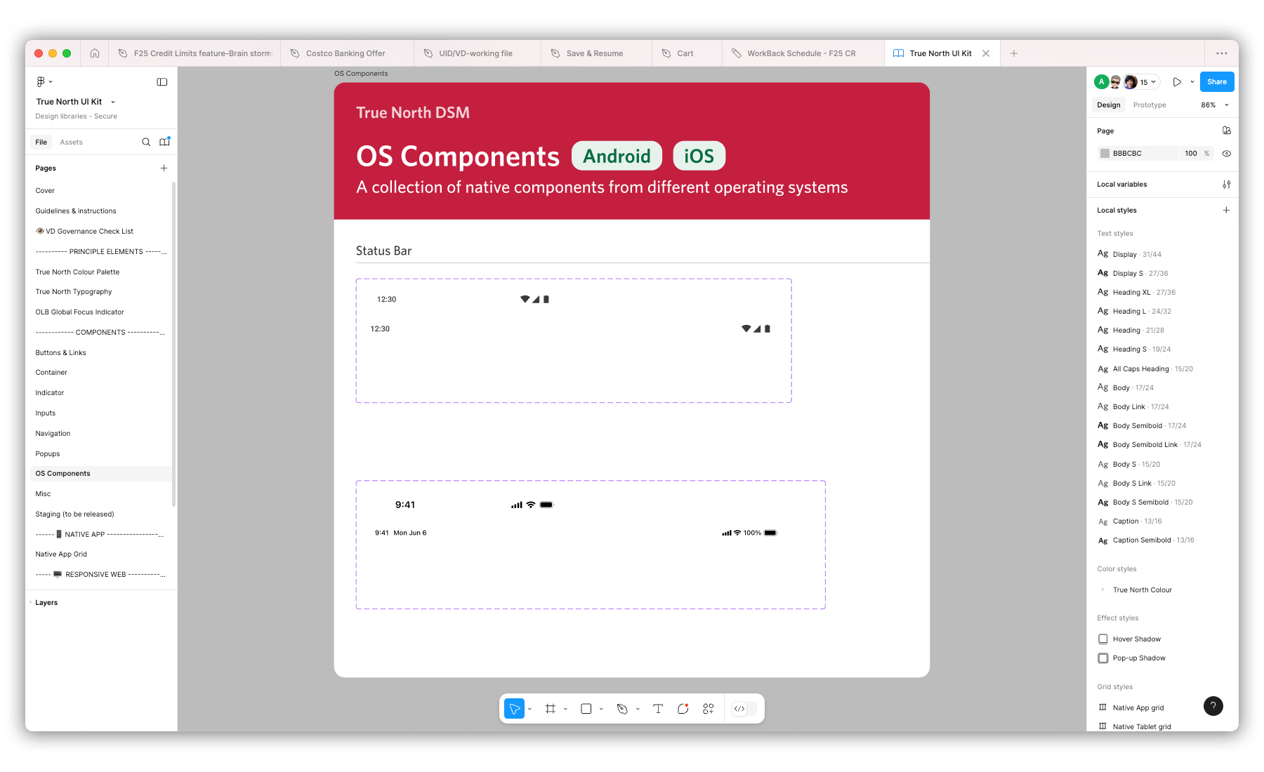
Below is a series of screenshots displaying the UI components in Figma app that I have built for CIBC's new digital branding website and mobile app.
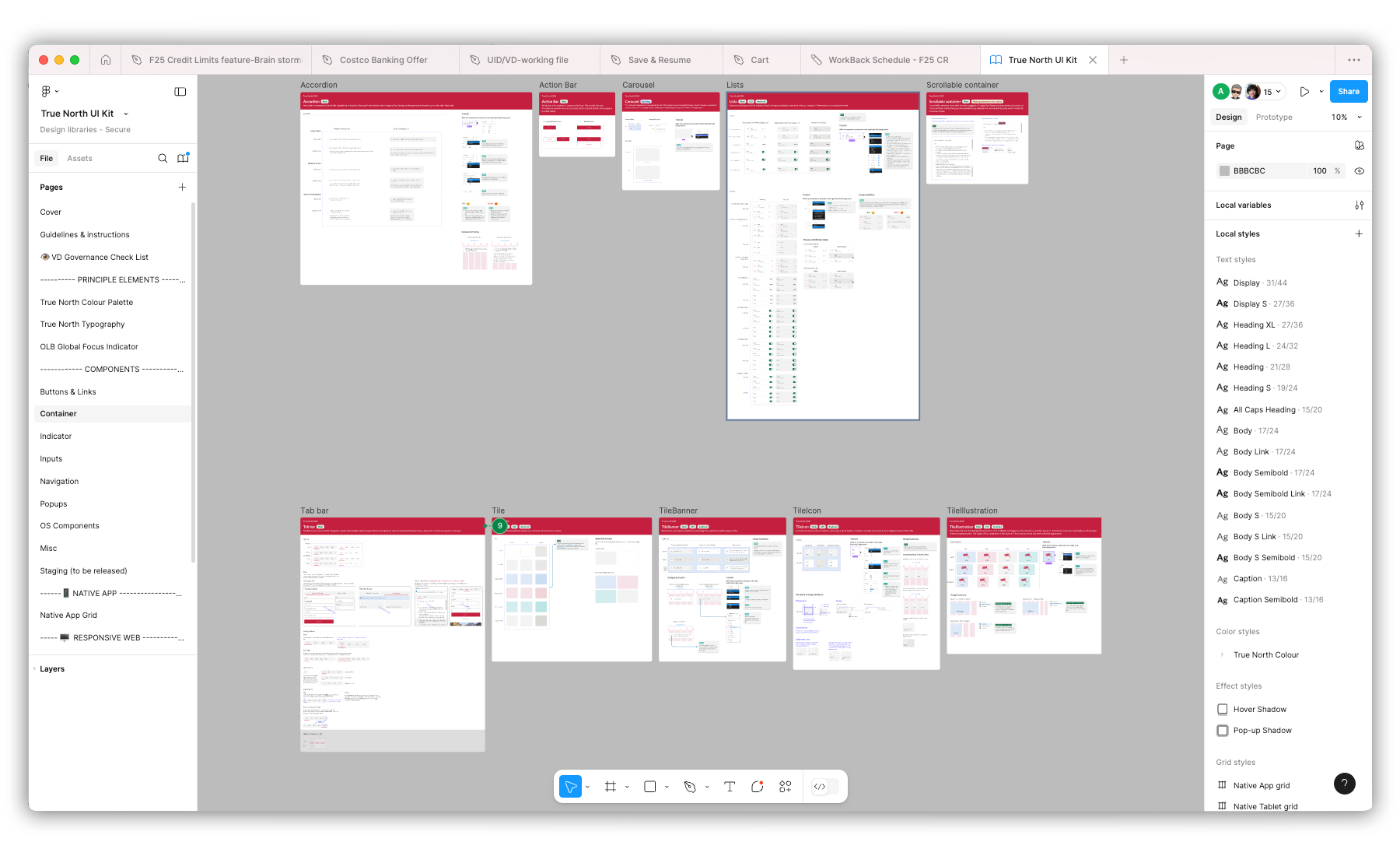
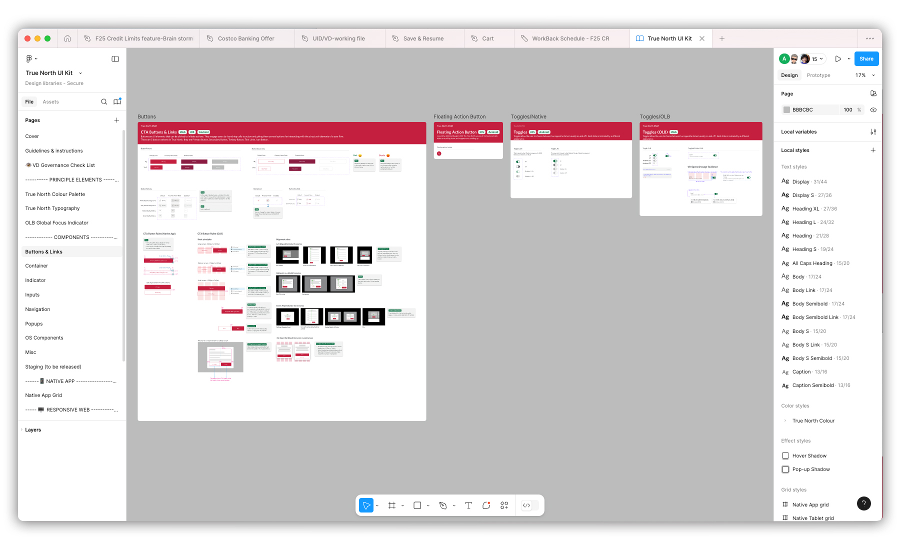
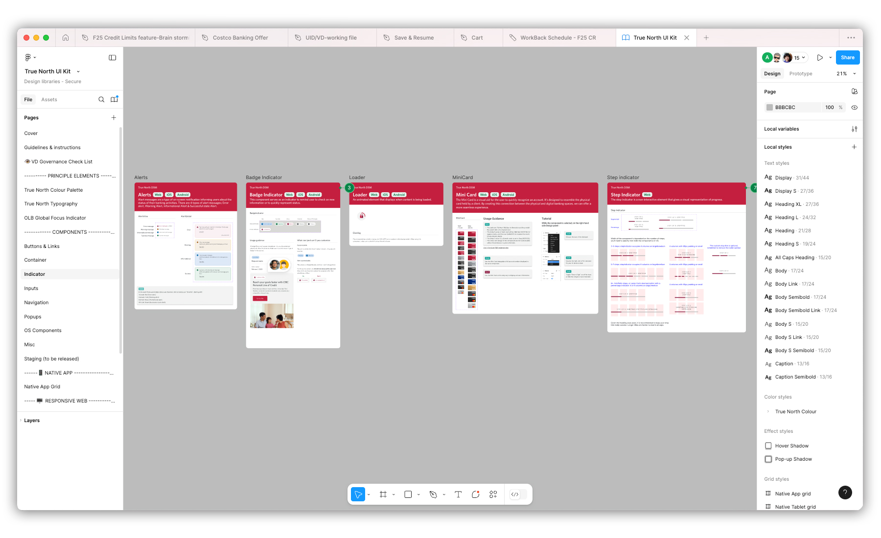
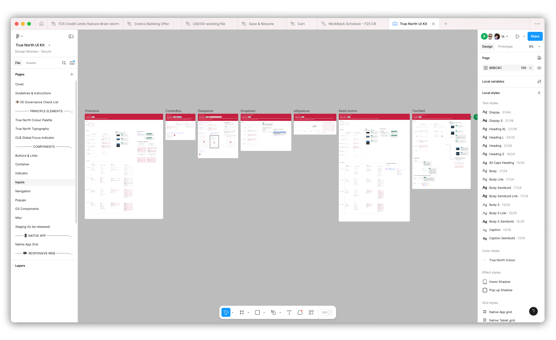
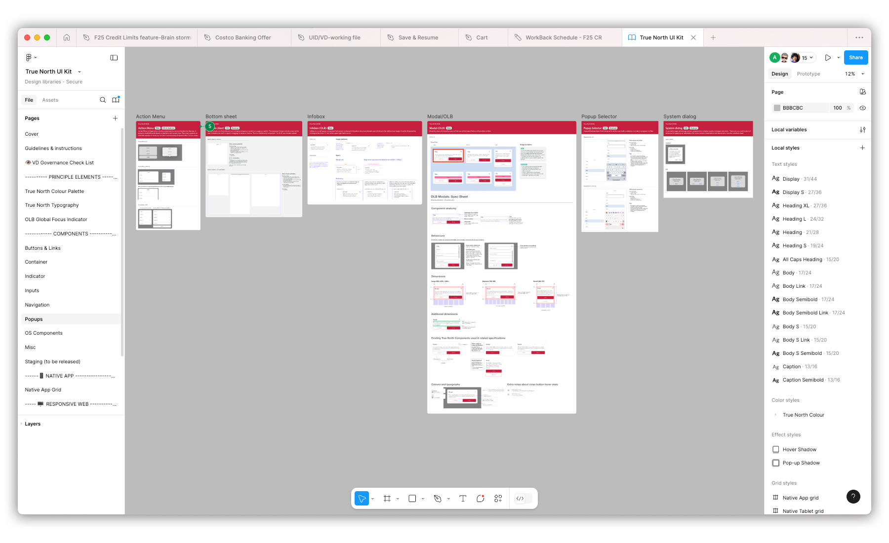
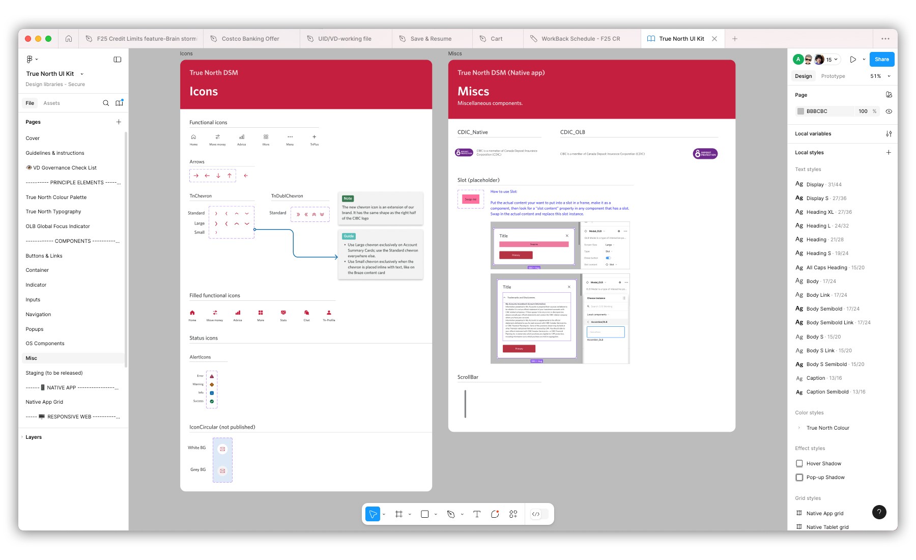
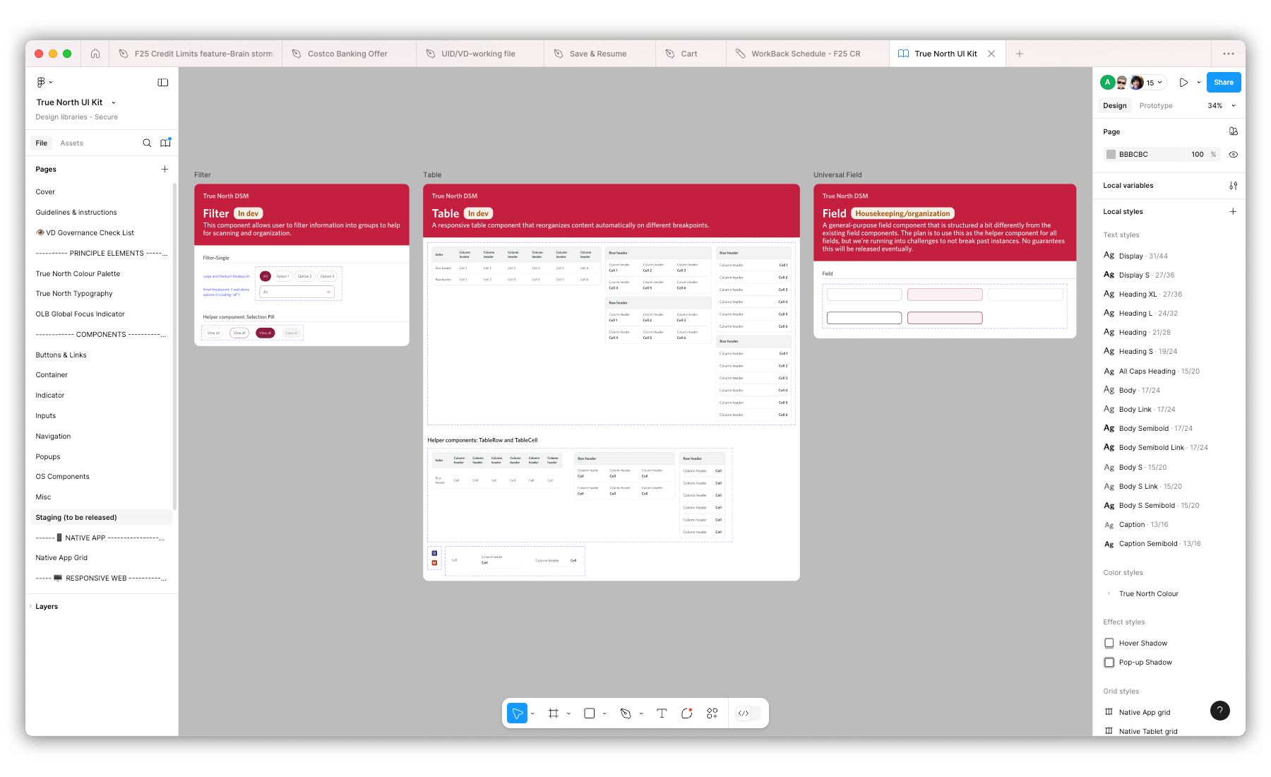
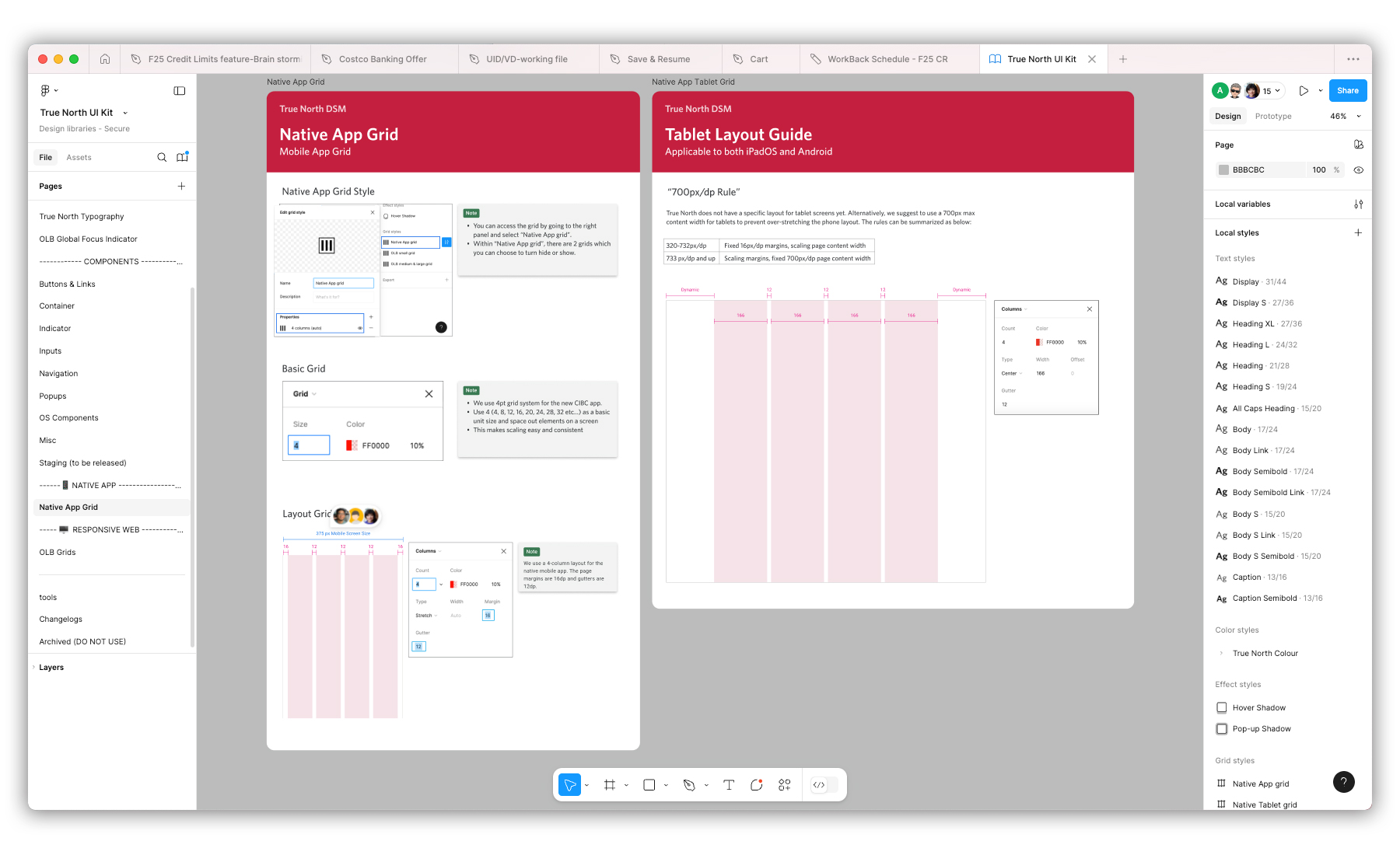
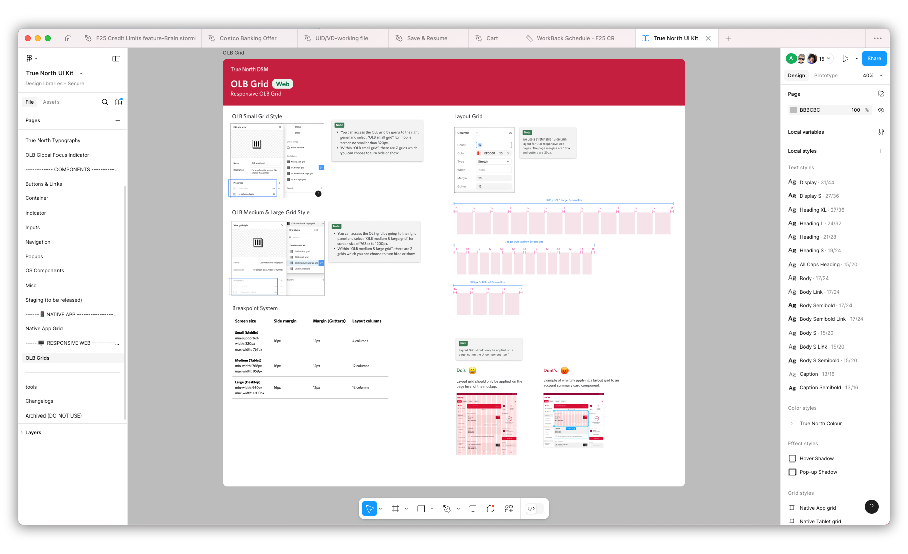
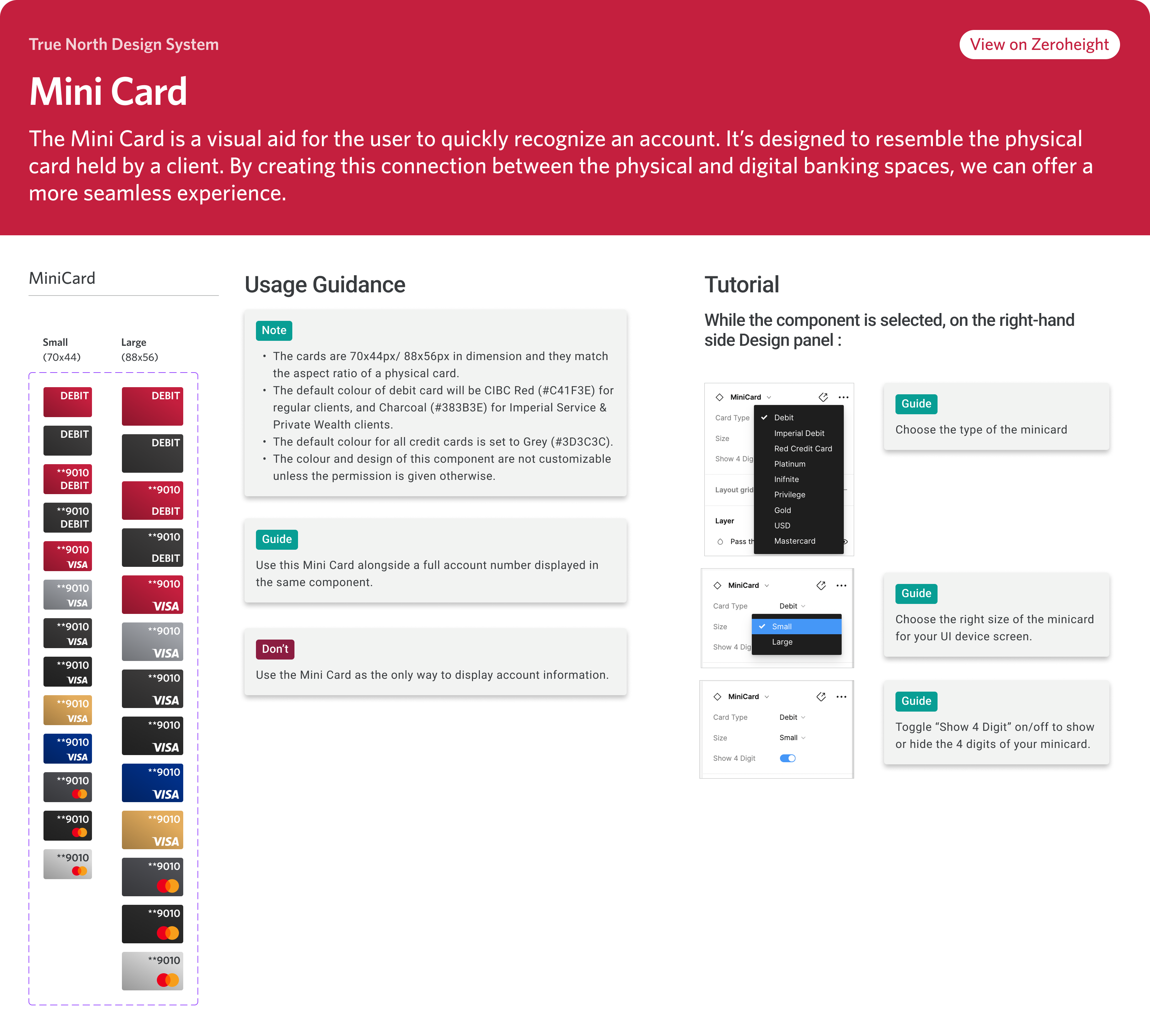
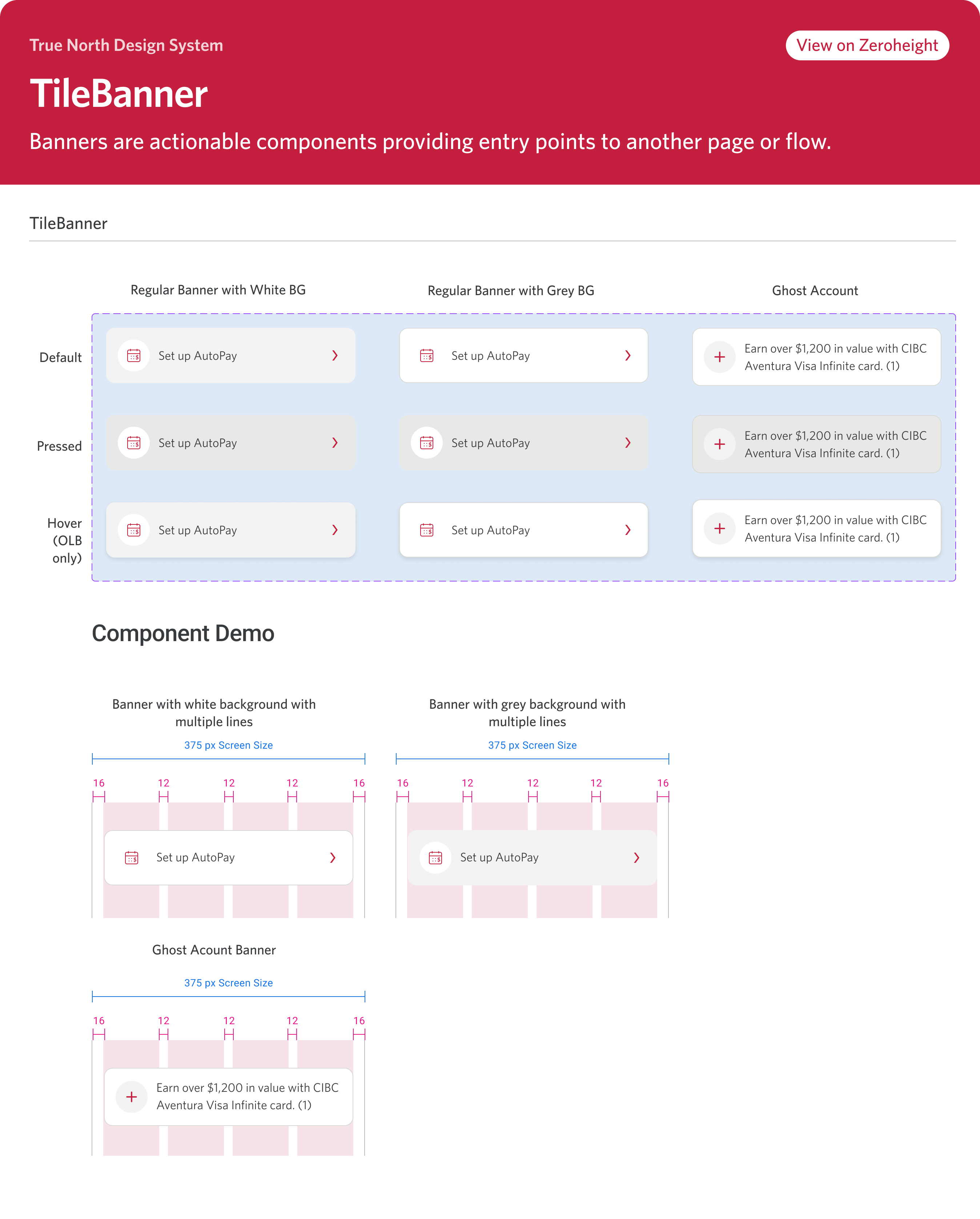
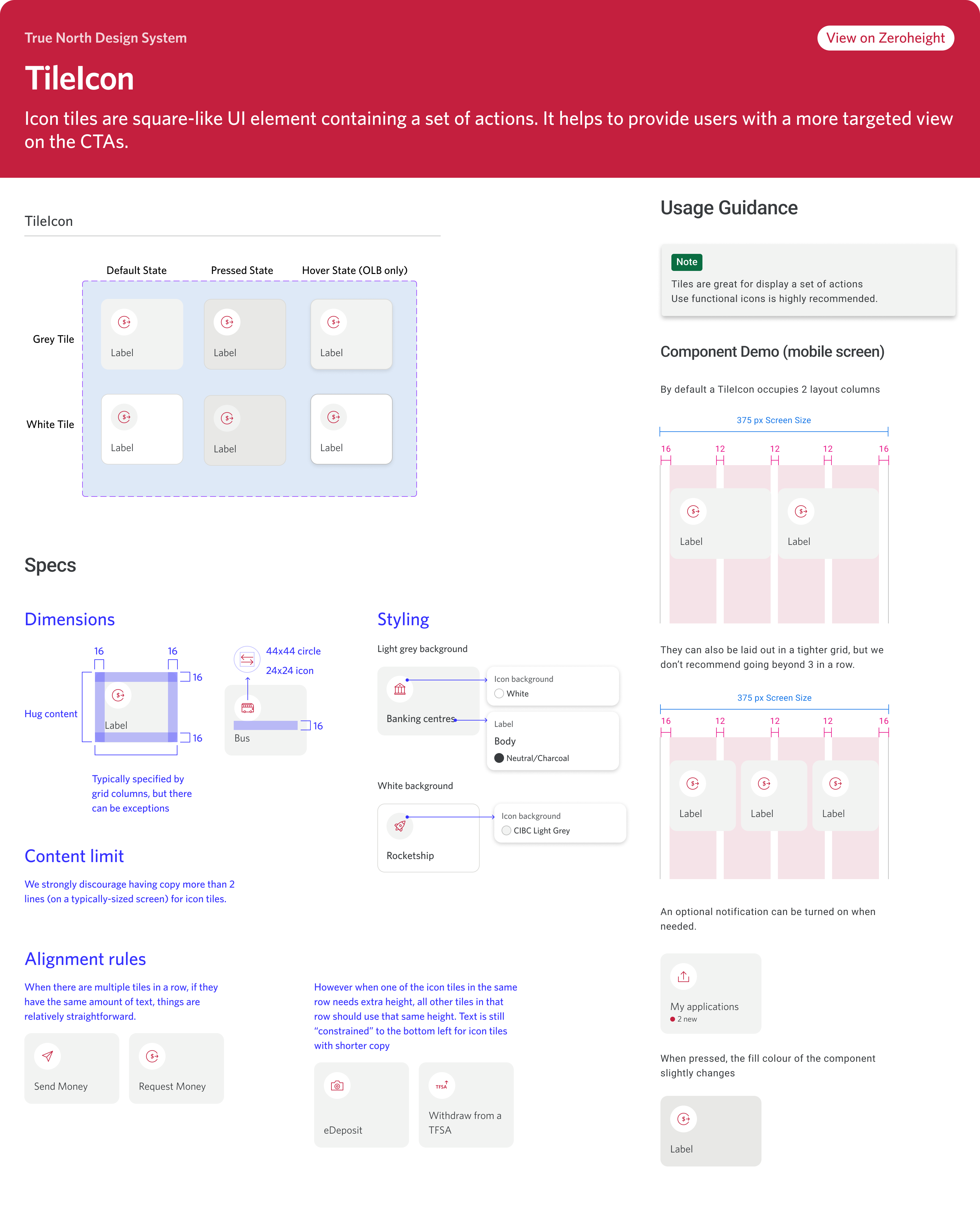
The following carousel provides a detailed look at a few UI components that I've developed for this kit. Each frame highlights a component’s name, its structural layout across various states and variants, as well as usage guidelines and concise tutorials. These visual aids were thoughtfully designed to support product designers in adopting Figma as their primary UI design tool, especially during the kit’s initial rollout. Each component also has link to it's respective documentation page on Zeroheight platform.
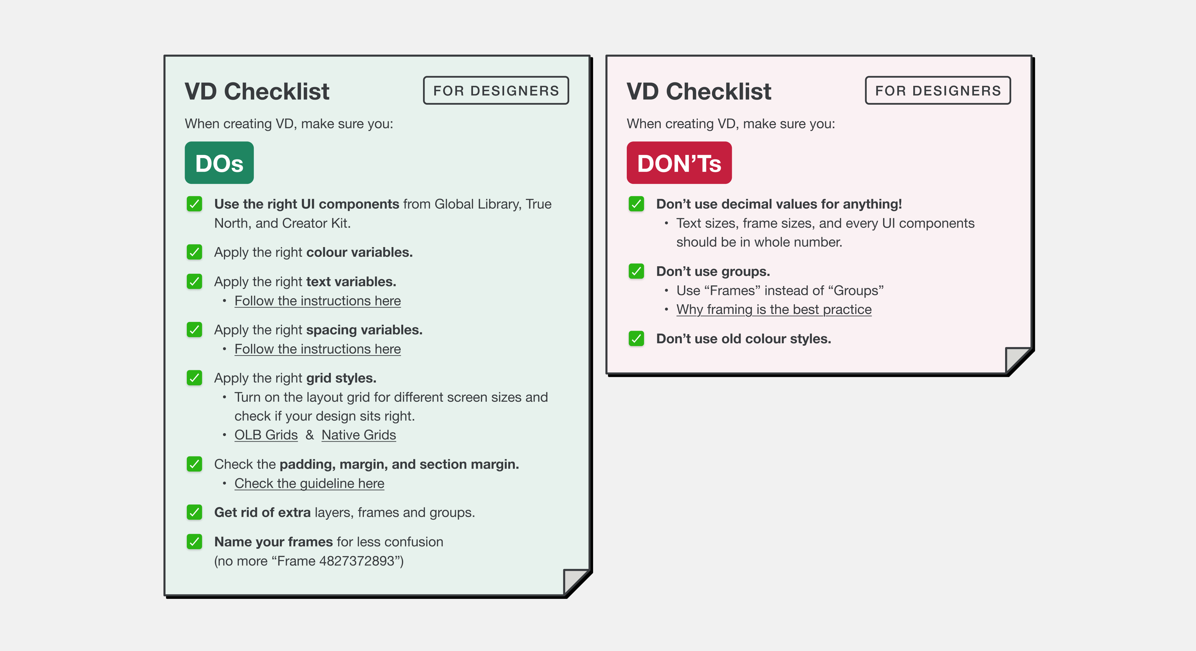
I conducted the Visual Design Goverance ritual to promote the good practice of using component/UI kit correctly. Below dispalys a checklist for product designer to go through before they handoff their design file to development team for production phase.
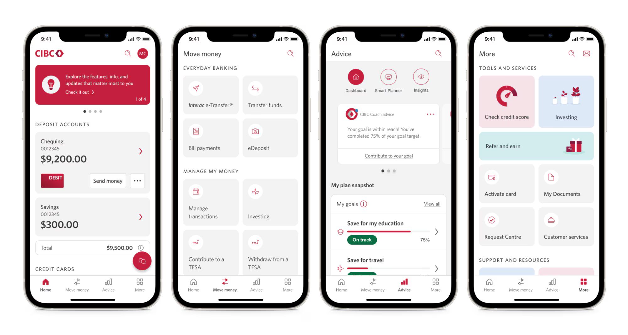
Below are 4 sample screenshots of new CIBC Banking app. Click here to read an article about one recent update of CIBC App.