Laurentian Bank UI Kit
Overview
The goal of this project is to evolve Laurentian Bank’s Security Design Figma UI Kit into a unified, one-stop design system that supports both internal designers and external vendor teams. While the original kit was adapted from the Public Design team’s library, it now requires clearer structure, stronger component foundations, and intentional scalability.
Mission
By refining existing components, introducing governance and consistency, and expanding the library thoughtfully, this initiative aims to create a reliable, future-ready toolkit that streamlines collaboration, accelerates delivery, and ensures a cohesive digital experience across Security products.
My role and What I Have Accomplished
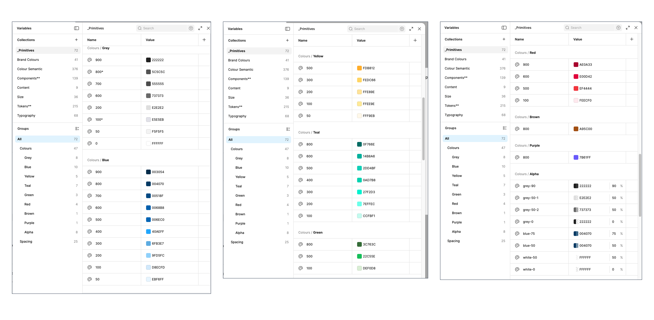
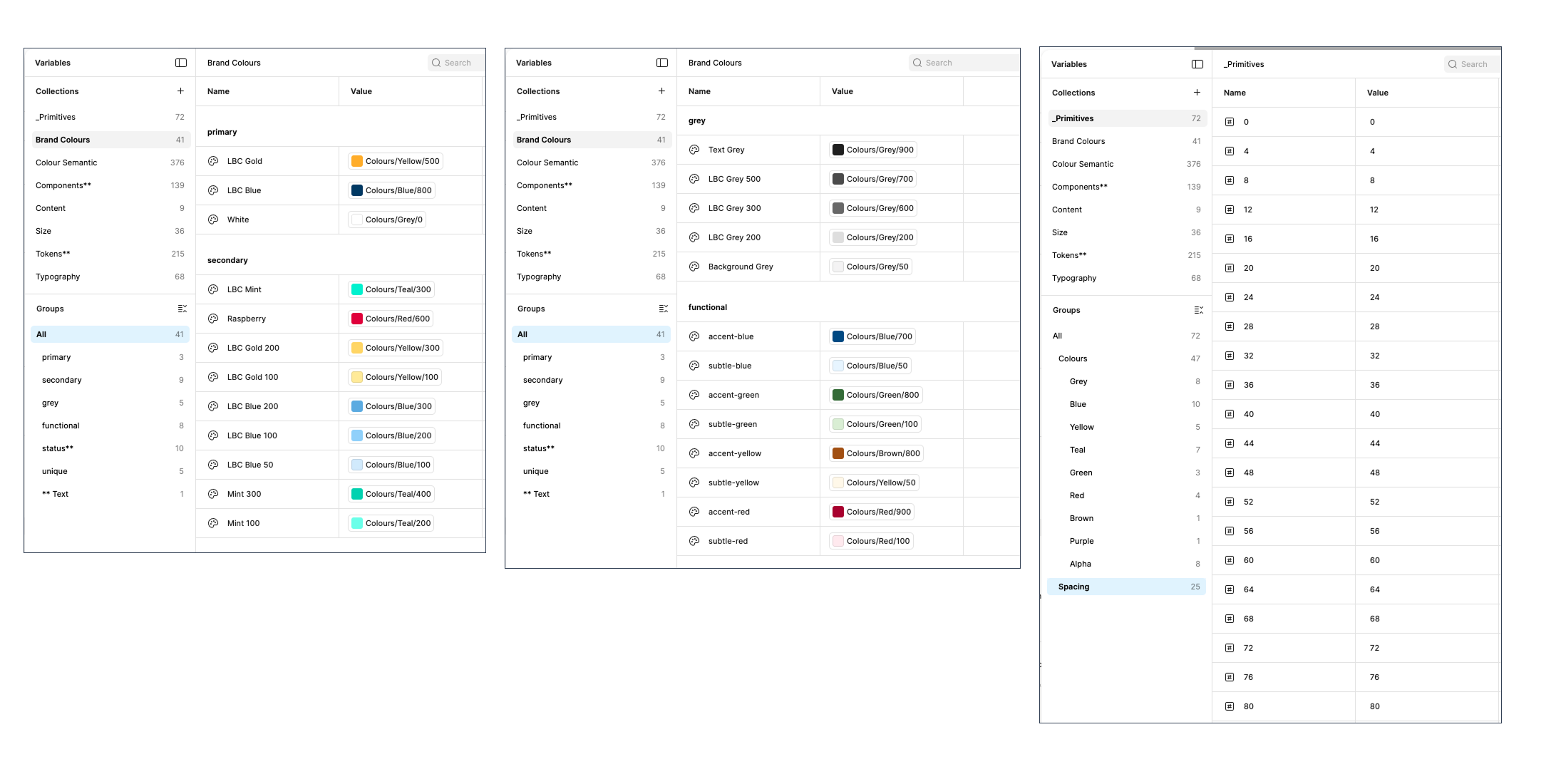
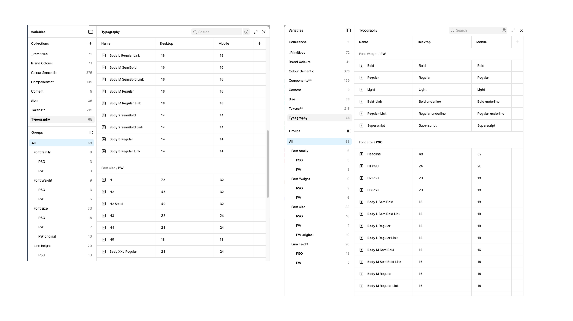
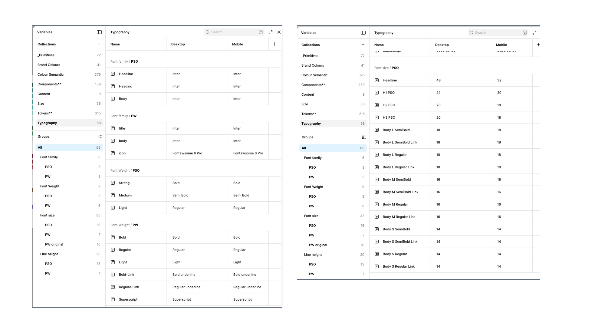
I reviewed the brand style guide and the secure banking team’s existing design files, then began rebuilding the design tokens for typography, color primitives, and spacing variables. I also audited the current components and refined their Auto Layout structures and variants to make them more accessible, scalable, and easier to use in future design projects. Building on these updated components, I created clearer, more comprehensive documentation within the same UI library.
Work Samples
Below screenshots shows some of the components and documentation that I have created in the Figma UI Kit.


Below are screenshots shows the design tokens in the form of variables in Figma that I have helped restructuring.